 |
| Click cartoon to bust some bigger rhymes |
Greetings, Dance Tracks and Beat Boxes!
Now sure, this week's cartoon seems pretty irreverent, but I'm making a point here. User interfaces are both an interest of mine, and a constant source of annoyance. One of my mutant powers seems to be and ability to spot those annoying problems in a interface, program or product design that are going to trip up users and make them crazy. Most such points of human/product interaction seem to be designed either by engineers who are concerned mainly with function and the coolness of the code, or designers who are interested mainly in aesthetics, and not usability.
To give you a couple of examples that makes me insane on a daily basis:
Charter Cable has seen fit to give me a Motorola DVR that seems to have been designed in the 1980s. The menu looks like the output from a Commodore 64, and the remote it terribly designed. Most especially, right above the "fast forward" button there is another button marked "live." So, when watching a show and fast-forwarding through a commercial, it's easy to hit "live," which takes you out of the program you're watching and into whatever is live on the tuner. It then takes several button pushes and menus to get back into your program, and about half the time you'll dump yourself back to the beginning of the program by accident, and have to fast-forward (careful you don't push the wrong button again!) to find the point the the program where you left off. This happens to me once or twice a night (and probably millions of times to other Charter customers) resulting in much cursing and yelling at the box, which does not have a "give a s&!t" button.
Less annoying but equally stupid are the comic pages of the Washington Post web-site. I read a couple of comics in enjoy there every day, Doonesbury, Pearls Before Swine, and a few others. (I subscribe to two newspapers on my Kindle, but neither of them includes comics.) We will ignore the fact that it's nearly impossible to scroll around the Washington Post comic pages with a touch screen (like on my phone, where I usually view them) without accidentally hitting an ad or a navigation link to someplace you don't want to go, or that the layout of the page (which takes forever to load and contains exactly ONE daily three-panel comic strip) pretty much requires scrolling to see the comic on a phone, no matter which way you orient the screen.
What's really stupid is if you want to see any strip but the current one, you've got to:
A: Select a date from a pull-down menu.
B: Wait for the pull down menu to go away.
C: Click a "go" button next to the pull-down. (Don't accidentally click the pull down again with your fat finger!)
D: Wait for the entire page to slowly reload you can again see one three panel comic strip.
Want to see the day before yesterday, or today's strip again? You've got to go through the whole thing again!
Now, admittedly, my navigation here is not much better, but they supposedly have highly-paid professional web designers, and I have me and Blogger to do this site. Anyway, look at most of the better designed web-comics, and they have "forward" and "backward" navigation buttons to view previous strips, and often clickable calendars as well. The Washington Post, on the other hand, apparently just likes to watch you jump through hoops and get annoyed for now reason.
Now, what has that got to do with today's panel? Well, one place where interface designers go wrong is to take a metaphor too far. Usually Apple is the one company that gets this stuff right, but (maybe because the late Steve Jobs notoriously didn't seem to "get" books at all) the iBooks app on the iPad included an animated, touch activate page turn. You could manually flip the page, and see the animated page moving on the screen in sync with your finger-tip.
Now, I'm sure this was a great thing for the software programmers and designers who came up with it and implemented it. From a "gee-wiz, look at my new toy" standpoint it was pretty neat. But from a usability standpoint, it was idiotic. It was taking the metaphor of the book too far, just because they could. It adds nothing to the usability or convenience of reading on the iPad, and in fact, the only reason is isn't totally in the way is that people are used to ignoring the intrusion of a page flip on a real book.
But when people first use a black-and-white epaper screen reader, they almost universally complain about the far quicker and less-intrusive "screen flash" that happens when you change pages. The reason, of course, is that while it's much quicker and less intrusive, you're less used to it, so of course you notice it more. Most people quickly get used to the "flash," and it's effectively invisible after a while. But the point is, anything that kicks you out of the reading experience is bad. You need to work to minimize those things. Apple's page-turn animation goes the other way.
Of course, you can turn the page flip off, but it's interesting that (at least up until recently), most people who read books on iPads used apps like Amazon's or Barne's and Noble's, and I believe those just change pages without any graphical showboating.
On the other hand, I saw this great video the other day showing a new way of using "page flips" to quickly navigate through a book, magazine or document, something that's very cumbersome to do on most menu and "forward/back button" operated ereaders.
This is a smart use of the page/book metaphor, not for showboating or unneeded cosmetics, but to actually use the familiar design of a printed book to make it easier and less intrusive to navigate through its electronic cousin. That's doing right what Apple did wrong.
So, getting back to today's cartoon, I do not need my iPad to animate page turns, or my mixdeck submarine console to make scratching sounds or play music, any more than a need my automobile to smell like a horse.
End of rant.
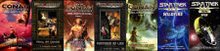
Speaking of ebooks, today's cartoon is brought to you by science fiction collection, "Walking the Virtch." Check it out on Amazon.com!
Also available on Nook, Smashwords, and other major ebook dealers!
See you guys back here next week!
- Minion Mixmaster Steve


No comments:
Post a Comment